April 3rd, 2026
The Economy
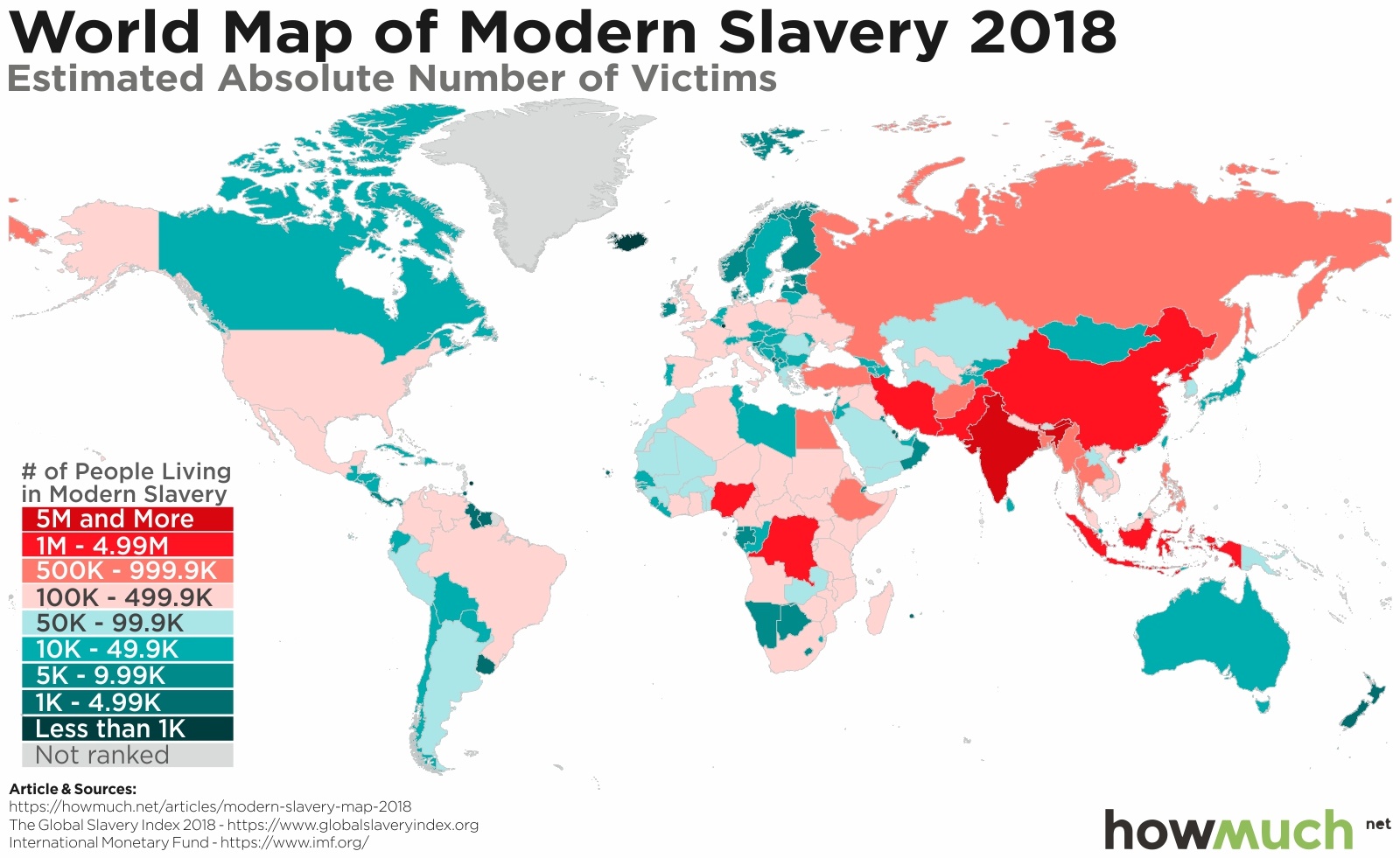
social-issues
Slavery is any type of system that forces people to be treated like property, including forced marriage, labor and human trafficking. Our maps shed light on the true extent modern-day slavery around the world today.

April 3rd, 2026
The Economy
The U.S. economy is constantly changing. We track the percentage increases and decreases of every major expenditure affecting your life for the past 20 years.

April 3rd, 2026
social-issues
The U.S. sends billions of dollars of weapons around the world every year. These maps break down America’s biggest competitors and which countries are the biggest purchasers of weapons “Made in America.”

April 3rd, 2026
The Economy
investments
Foreign direct investment declined in the last several months as the global economy slowed and trade wars heated up. But the U.S. and China still lead the world as overseas capital looks for investment opportunities.

April 3rd, 2026
Personal Finance
debt
Americans have taken on over $1 trillion in total credit card debt. Our map shows how long it will take the average borrower in every state to pay it all back.
April 3rd, 2026
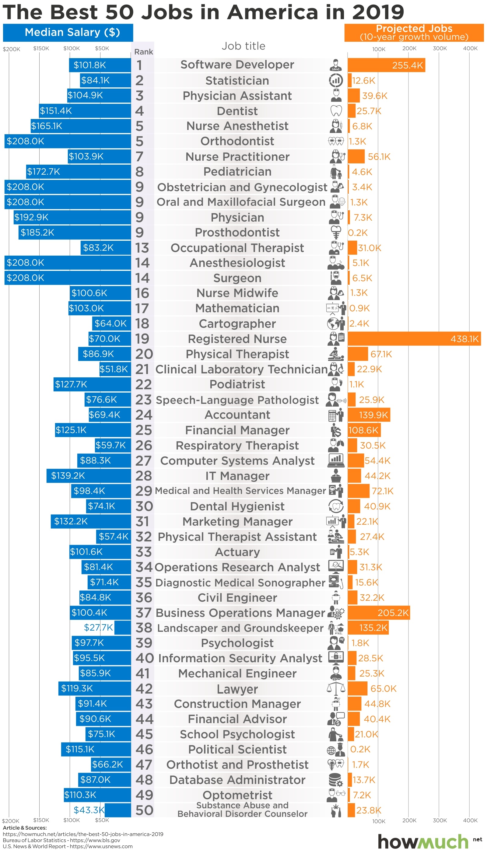
jobs
The best jobs almost always have a few things in common. They are in demand, pay well, and require some degree of training. If you’re thinking about a career change, this visualization is a good place to start.
April 3rd, 2026
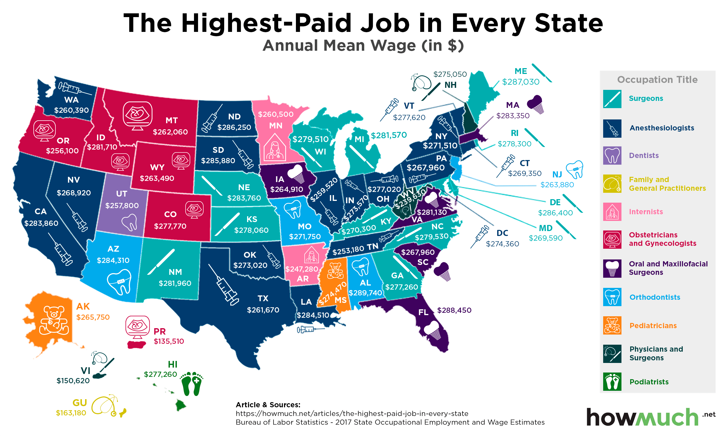
jobs
Making a six-figure income is a career milestone for most people, and it turns out the highest paid occupations make substantially more than that. Our newest map shows which jobs pay the best in each state.
April 3rd, 2026
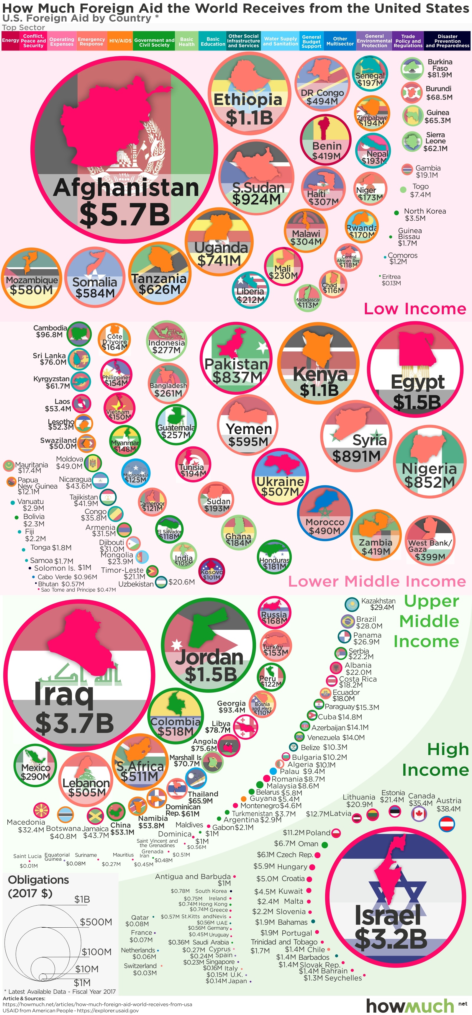
The Economy
social-issues
President Trump constantly threatens to cut foreign aid, but he hasn’t changed much over the last 2 years. Our visualization breaks down the countries and issues continuing to receive money during Trump's administration.

April 3rd, 2026
The Economy
The best way to compare economies between vastly different sized countries if GDP per capita. Our new series of maps provide a snapshot of the enormous inequality around the world in a true apples-to-apples comparison.
April 3rd, 2026
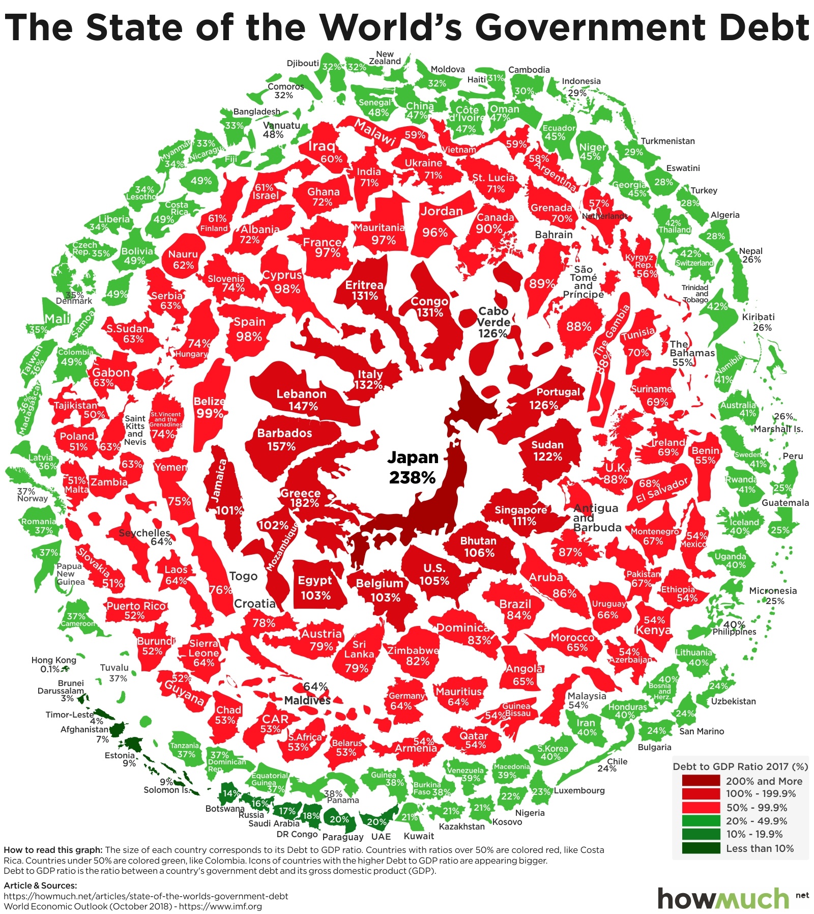
The Economy
debt
Policymakers have avoided dealing with debt for years, guaranteeing that any resolution will be more painful. This visualization shows which countries have the biggest problems with national debt relative to their economic size.