April 3rd, 2026
cryptocurrencies
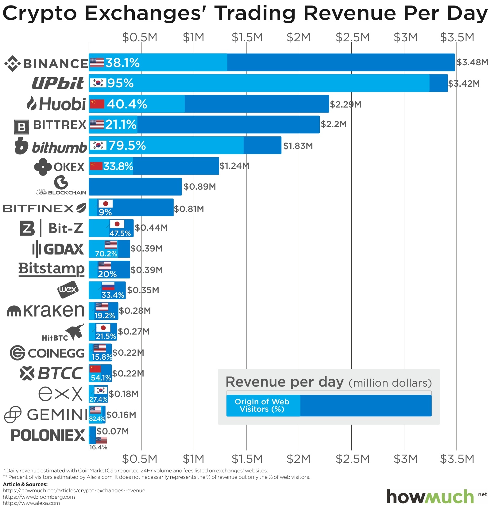
The top cryptocurrency exchanges are trading over 1 billion USD worth of crypto every day. What do these exchanges have in common and what strategies are they using to remain profitable in an ever-changing market?

April 3rd, 2026
Wealth
How many people have over $500M in personal wealth and where do they live? Our new chart creates a snapshot of the ultra-elite, letting you easily see how many half-billionaires call which countries home.
April 3rd, 2026
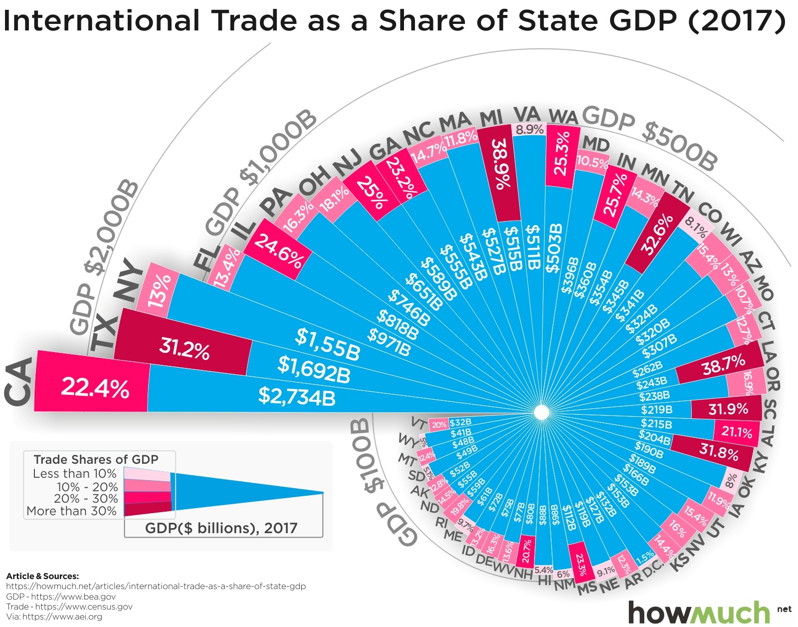
The Economy
social-issues
International trade is dominating the headlines, but how important is it to the broader economy? Our new graph breaks down how much each state’s GDP comes from importing and exporting goods.
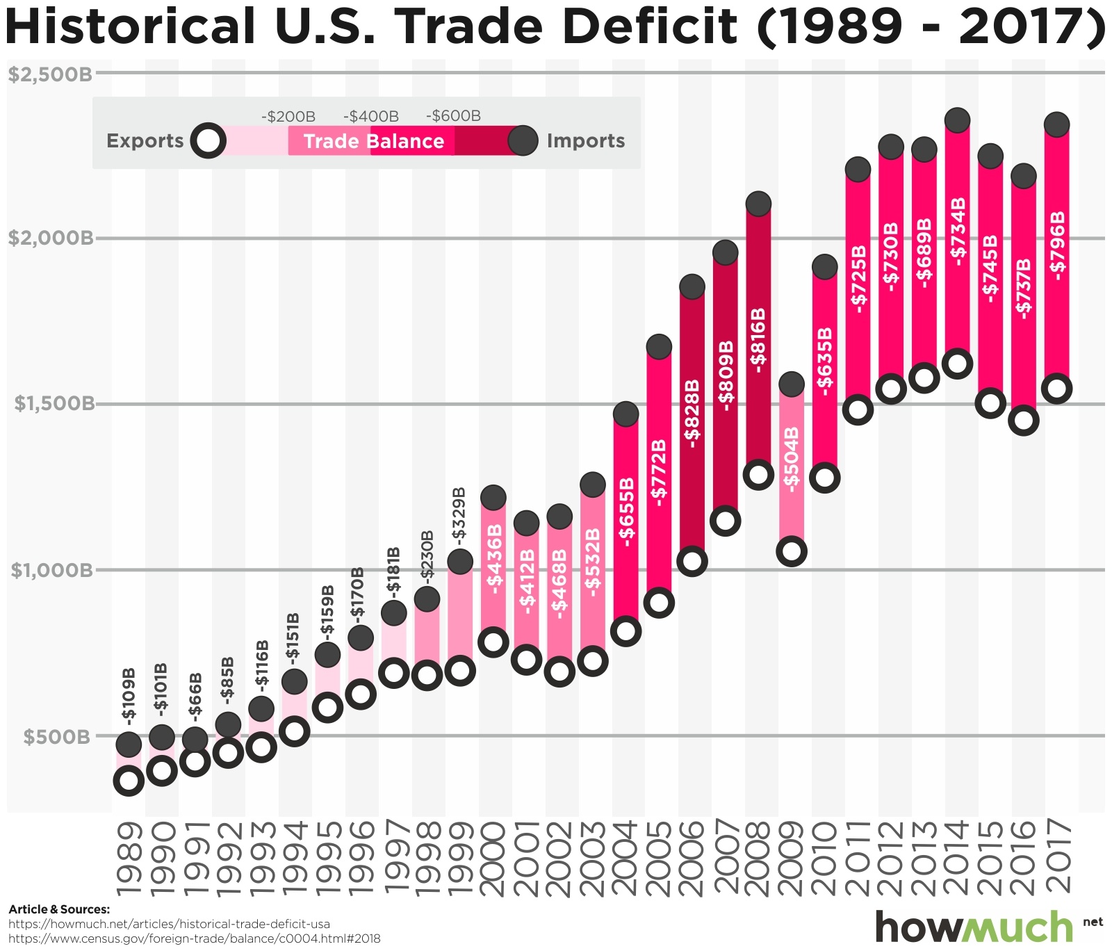
April 3rd, 2026
The Economy
President Trump is currently focused on imposing tariffs to reduce the U.S. trade deficit. Our new graph illustrates the current situation.
April 3rd, 2026
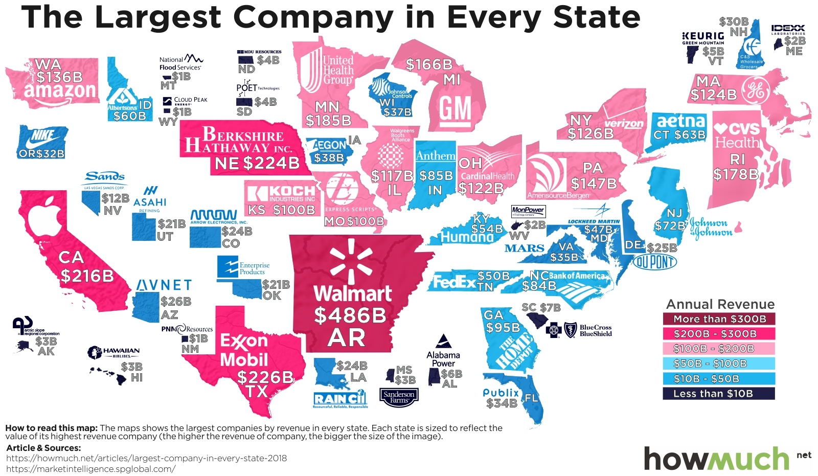
business
If large companies generate the most economic growth, then some states are out of luck. Our new map creates a snapshot of the American economy by highlighting the biggest companies, measured by revenue, in every state.
April 3rd, 2026
social-issues
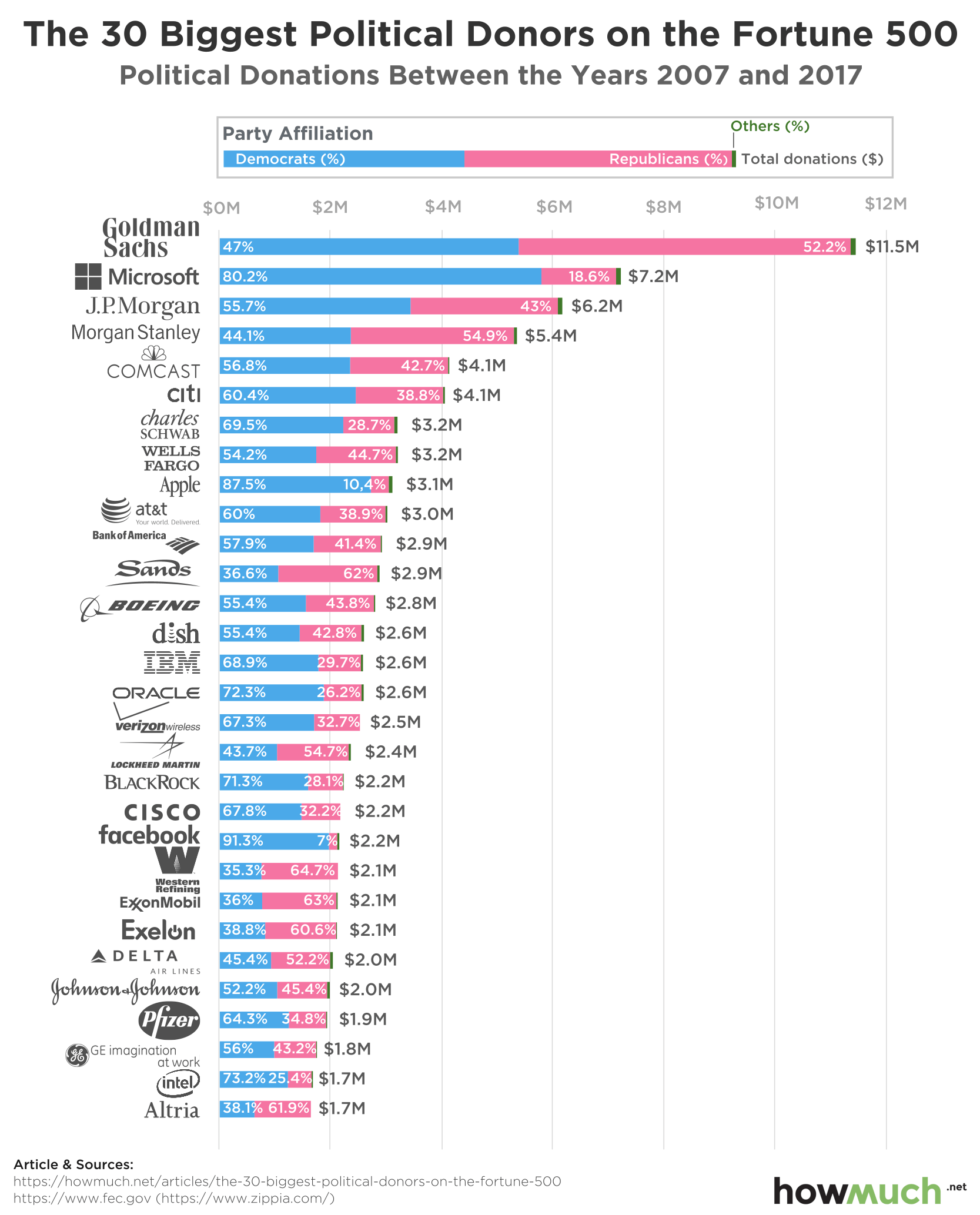
A variety of large companies have spent billions of dollars getting politicians elected over the past decade, but have Democrats or Republicans benefited the most? Our new graph breaks down the Fortune 500’s most politically active companies in terms of campaign contributions.
April 3rd, 2026
Personal Finance
The Economy
jobs
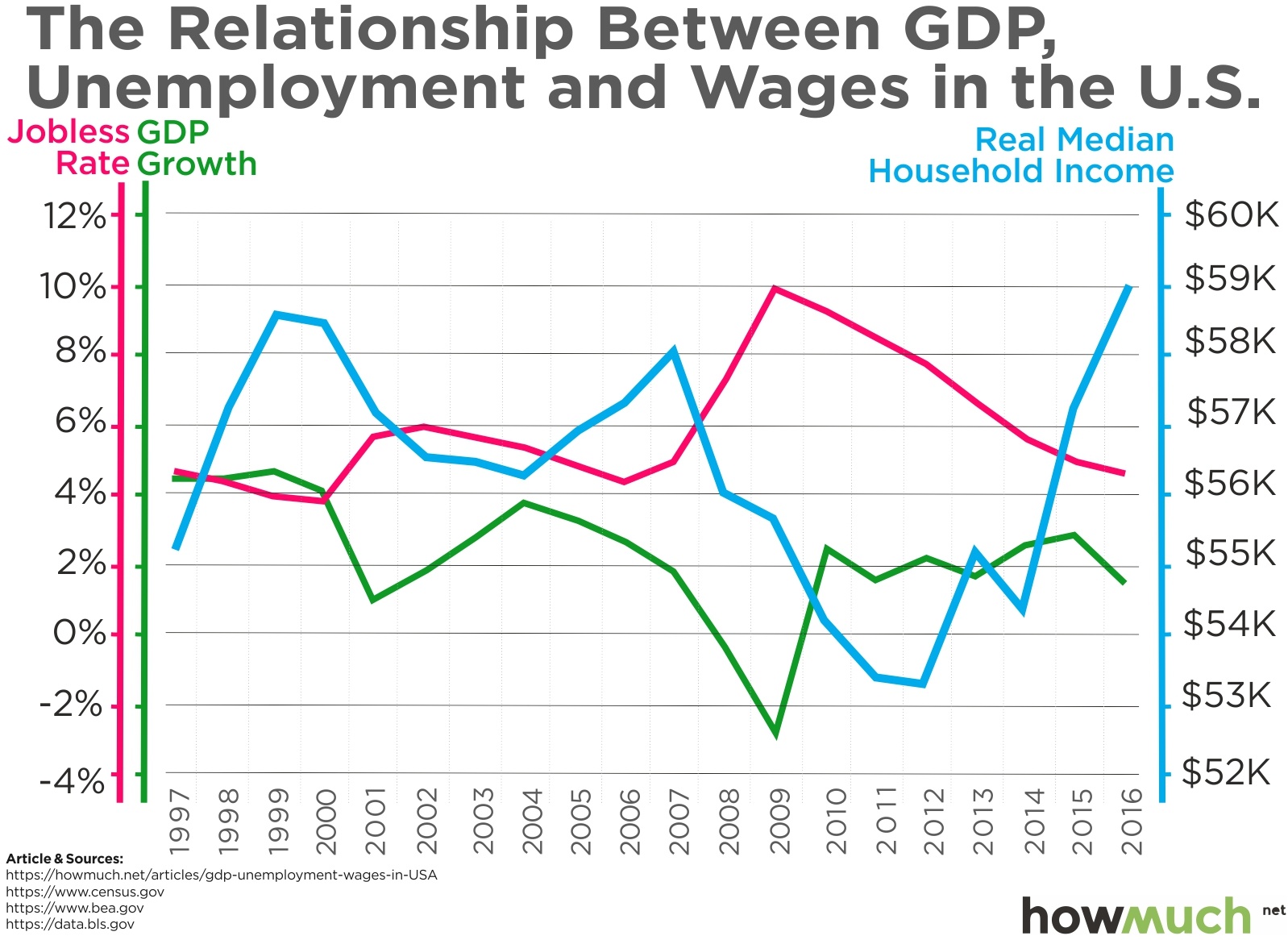
President Trump wants to see 6% economic growth during his administration. What would that mean for the American economy? Our new graph breaks down the relationship between GDP, unemployment, and wages.

April 3rd, 2026
cryptocurrencies
Wealth
In the new era of cryptocurrency boom and bust, a few people have made astronomical profits. Some even have realistic aspirations of becoming the world’s first trillionaire. Find out more about them in this article.

April 3rd, 2026
business
Every company wants to cultivate a desirable brand commanding respect and attention. Our new viz presents a unique snapshot of the economy by analyzing the top 50 most admired companies in the world.

April 3rd, 2026
business
The local bank is a cornerstone of small towns, but in an age of global finance some banks now have hundreds of billions in deposits. Our new map shows the biggest ones in every state.