
April 3rd, 2026
Personal Finance
Gas prices rise and fall, but either way it makes your wallet slimmer. If you want to save on gas costs, aim for this gas station chain in your state.

April 3rd, 2026
Personal Finance
Looking to save on health insurance? Both average insurance rates and average annual deductibles differ among the 50 states. View our charts to see which state does health care the best.

April 3rd, 2026
Personal Finance
taxes
Everyone wants to save money on their taxes. But which state saves you the most? View our map of the United States to find out.

April 3rd, 2026
cryptocurrencies
The rise of cryptocurrencies has exceeded all expectations and, while the concept is still very young, it does have potential to shake up the aging fiat system

April 3rd, 2026
Personal Finance
taxes
President Trump is about to unveil a new infrastructure plan, which is rumored to include a hike in the federal gasoline tax. Our map explores how state and federal taxes affect the price you pay at the pump today.

April 3rd, 2026
cryptocurrencies
Bitcoin has “crashed” many times over the past several years, but how does this latest downturn compare to past steep sell offs?

April 3rd, 2026
The Economy
People send billions of dollars overseas every day. Our new map explores the size of the remittance market by analyzing the total cash flow leaving the U.S. to every country in the world.

April 3rd, 2026
The Economy
Serving as governor is a tough job with a lot of responsibilities, but our new analysis shows ait is not a surefire way to earn a high salary. See how governors’ compensation wildly fluctuates from state to state.
April 3rd, 2026
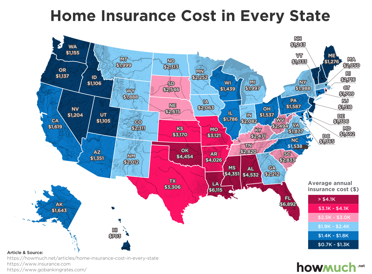
Personal Finance
Getting home insurance is a smart way to protect your family’s financial security in the event of disaster, but our new map reveals how the cost of insurance depends entirely on where you live.

April 3rd, 2026
Personal Finance
Most Americans live in cities, but the best places to live are hiding just outside urban areas.