
April 3rd, 2026
business
Brands constantly change with customer expectations. Our new map shows which high-value companies have the strongest brand recognition in the world this year.

April 3rd, 2026
The Economy
Obamacare expanded Medicaid, and our new map breaks down the new funding environment for every state in the country.

April 3rd, 2026
cryptocurrencies
The cryptocurrency’s meteoric rise has stunned the world and defied traditional laws of market behavior. After years of being labelled as an “experiment,” “bubble,” and “fade,” the cryptocurrency market continues to remain overall resilient in the face of incredible uncertainty.

April 3rd, 2026
cryptocurrencies
In 2017, the number of bitcoin ATMs doubled. Now you can exchange money for cryptocurrency and vice versa in more than 2000 machines installed in more than sixty countries.
April 3rd, 2026
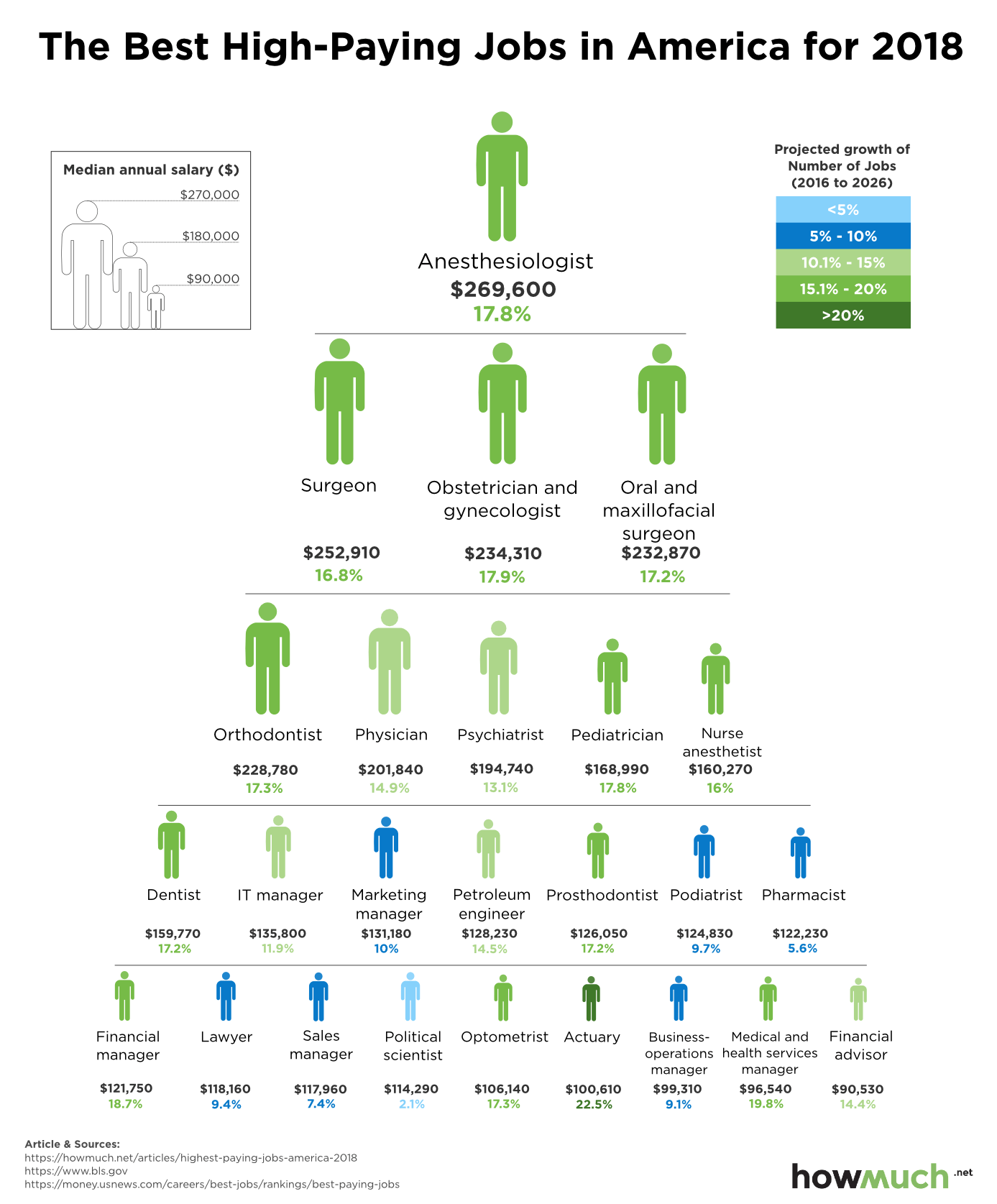
jobs
The medical field dominates our rankings, but doctors aren’t projected to have the strongest job growth over the next decade.
April 3rd, 2026
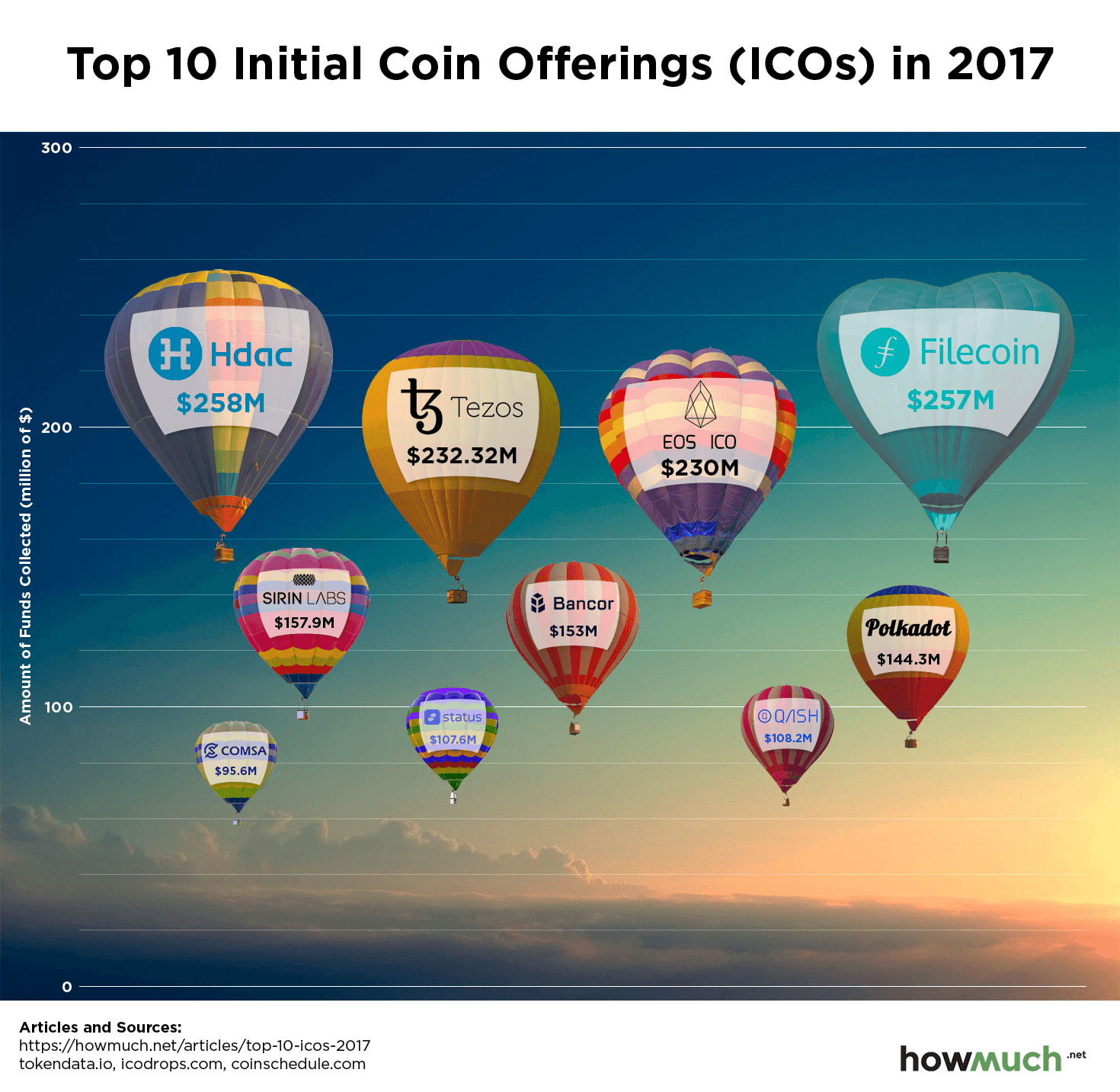
cryptocurrencies
Initial Coin Offerings (ICO) took off in 2017, as crypto-fever continues to reach new heights.

April 3rd, 2026
The Economy
trade
A widely accepted symbol of status and love, diamonds are big business. They cross borders all over the world, and – in some cases – the biggest players in the diamond industry aren’t who you think!
April 3rd, 2026
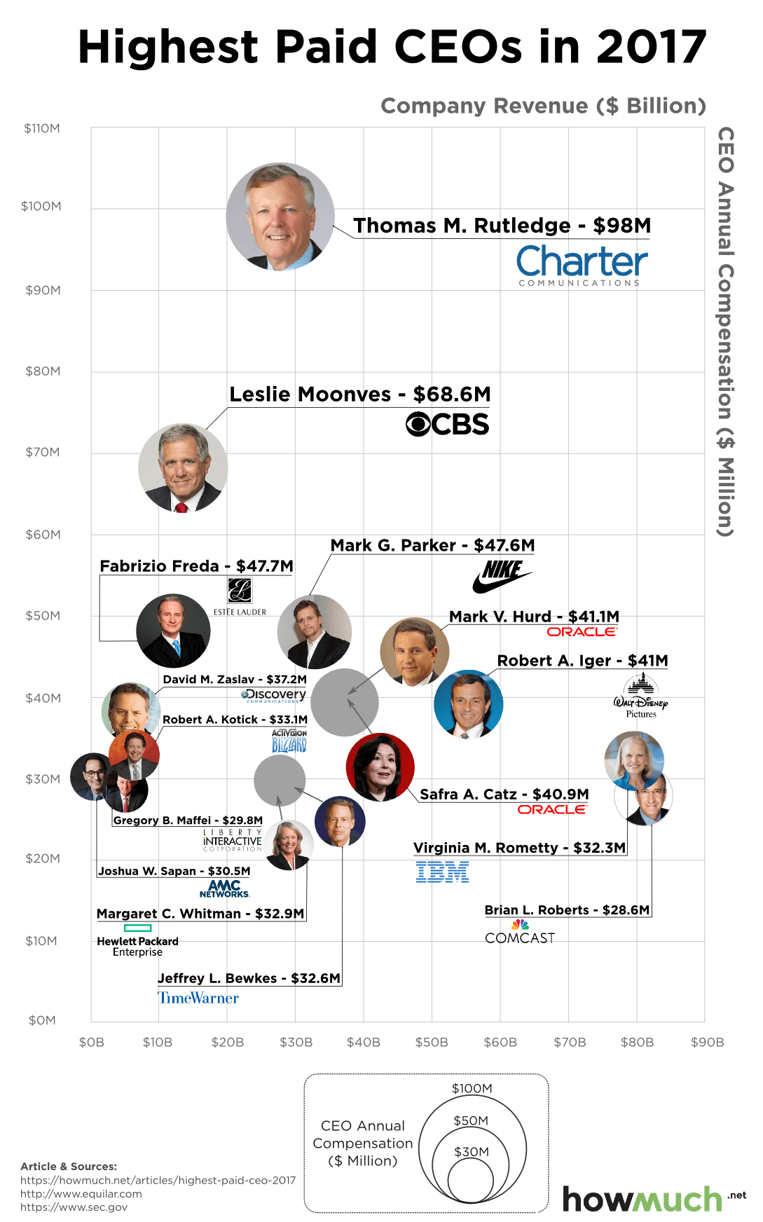
business
Our new chart examines the relationship between a company’s annual revenue and the compensation of its CEO. It doesn’t always make sense.

April 3rd, 2026
cryptocurrencies
Bitcoin’s popularity has increased exponentially over the past year, as cryptocurrency continues to go mainstream. However, not everyone is excited and optimistic about Bitcoin

April 3rd, 2026
business
Only a handful of companies dominate the sports brand and athletic apparel markets. Can you guess which ones?