April 3rd, 2026
The Economy
social-issues
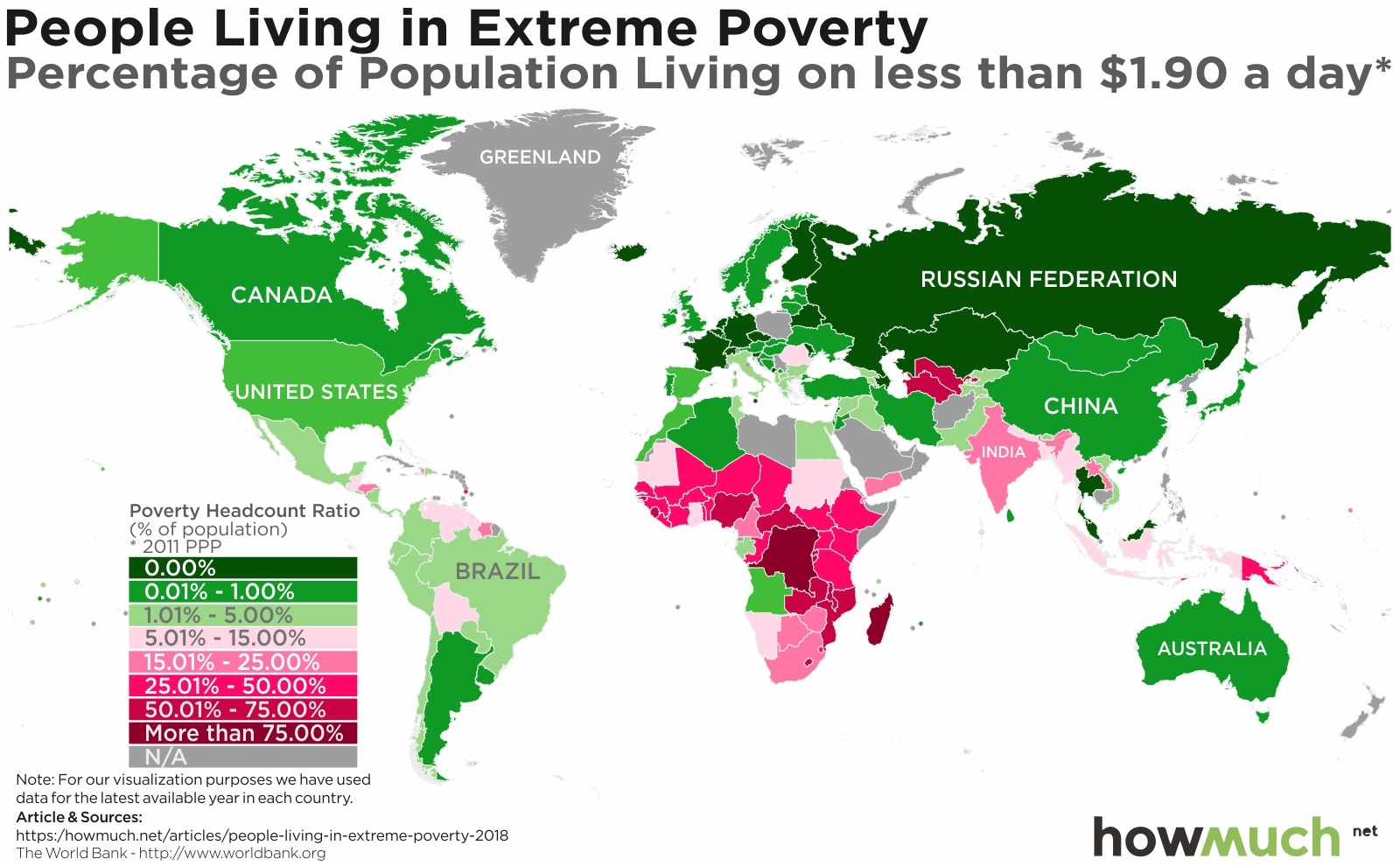
Extreme poverty is on the decline, but there are still lots of countries with crushing rates of subsistence living. Our new series of maps highlights where the have’s and have-not’s live around the world.

April 3rd, 2026
The Economy
debt
The U.S. national debt is now well over $21 trillion, but how did we get here? Our visualization explores which U.S. Presidents have added the most to the national debt since the country’s first budget in 1789.
April 3rd, 2026
Personal Finance
taxes
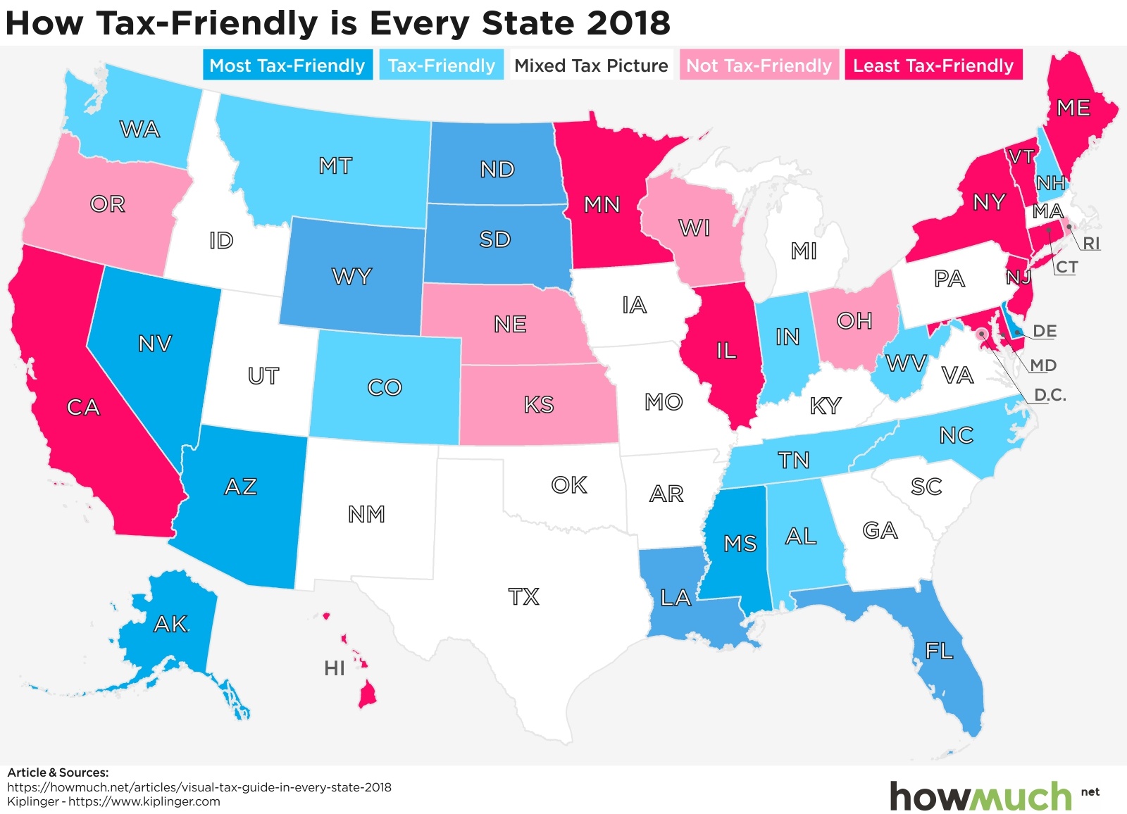
The media is hyper-focused on federal tax policy, but is that the right approach? We take a deep dive into state taxes on income, sales, gasoline and death to understand how your tax burden depends on where you live.

April 3rd, 2026
social-issues
Wealth
There’s a new Forbes 400 billionaire list, but this time with a twist. There’s a new metric that shakes things up.

April 3rd, 2026
The Economy
trade
Think your car is all American? Think again. It may have come from one of these countries. A global trade war is in full swing. This visualization on U.S. auto imports may give you some perspective.
April 3rd, 2026
Personal Finance
jobs
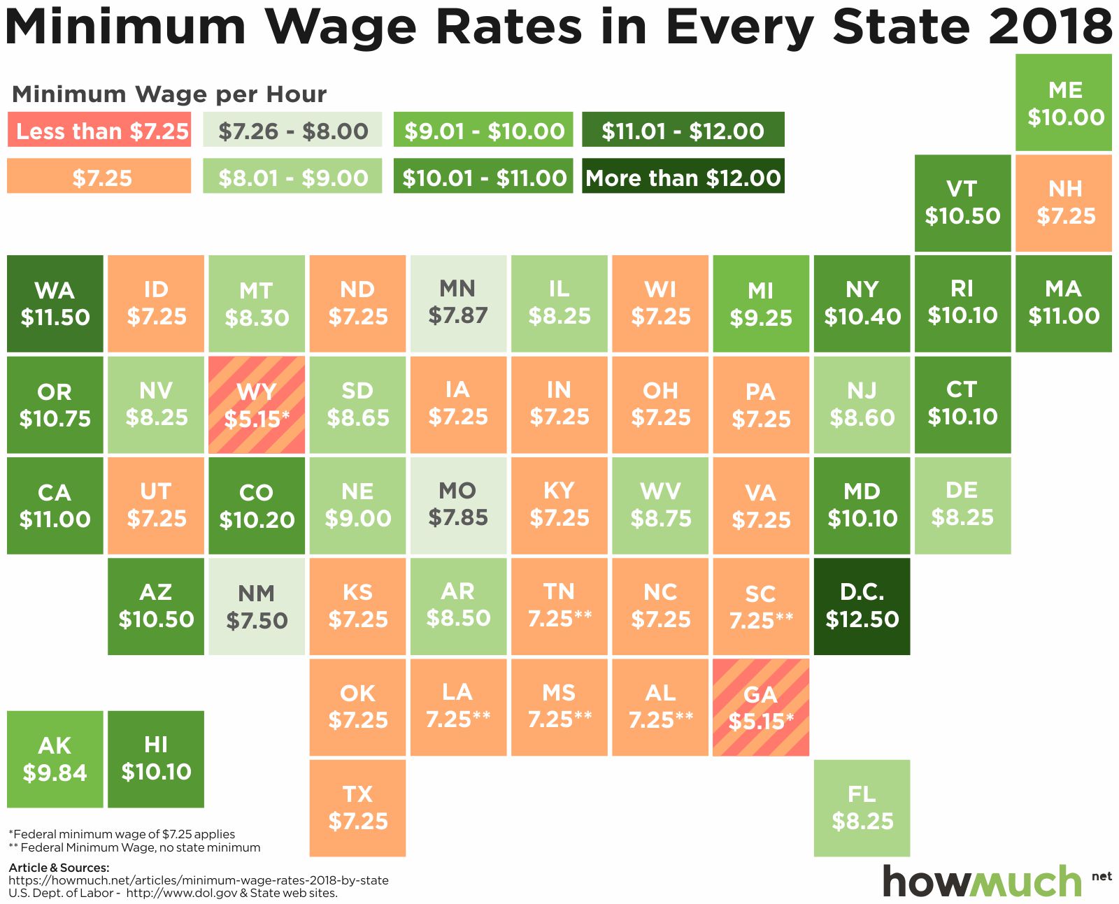
One of the most hotly contested political debates in the United States is the minimum wage. Pro-business advocates say a high minimum wage hurts business, while pro-labor advocates say the minimum wage should be raised to help the working poor. Have a look at our chart below to see your state’s minimum wage.
April 3rd, 2026
The Economy
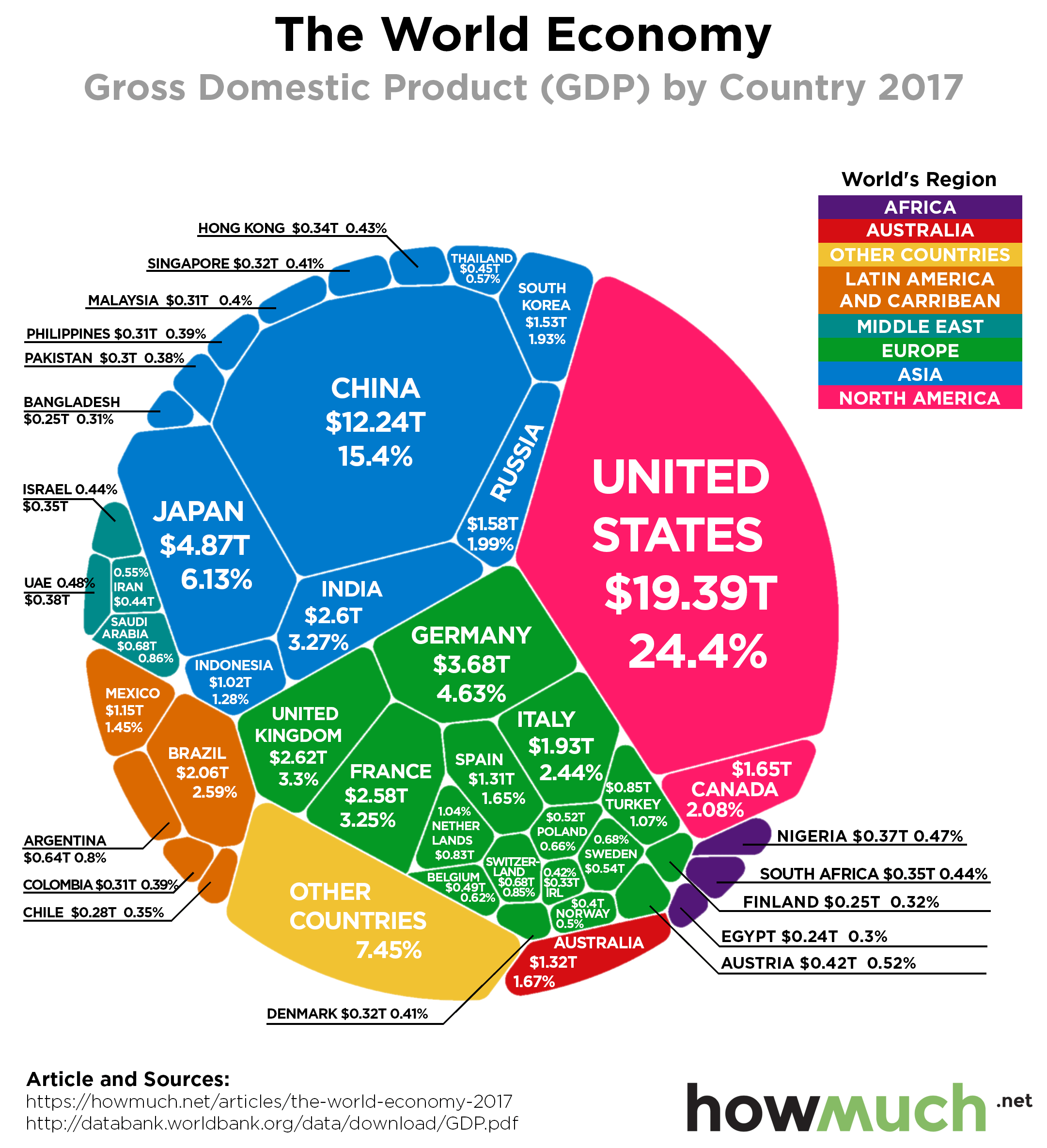
President Trump is signing trade deals and threatening more tariffs, vowing to shake up the global economic order. Our new visualization puts the world’s economies in stark contrast: it’s the U.S. and everybody else.

April 3rd, 2026
Personal Finance
debt
Student debt is a drag on the U.S. economy. Our new visualization explores the extent of the problem across the country, revealing that student debt levels have everything to do with where people go to school.

April 3rd, 2026
business
It’s no secret tech companies dominate the marketplace today, but do you know which regions and industries produce the most winners? Our newest visualization analyzes the top 50 tech companies in the world.

April 3rd, 2026
business
We partnered with Brand Finance to create a new map highlighting the strongest and most valuable retail brands. The results indicate which companies (and countries) are dominating one of the most competitive industries in the world.